Plot raster/array#
Library#
import the libraries
1from Hapi.visualizer import Visualize as vis
2import gdal
3import pandas as pd
Paths#
define paths to the raster file.
1RasterAPath = "data/GIS/Hapi_GIS_Data/acc4000.tif"
Read the raster#
-To plot the array you need to read the raster using gdal.
1src = gdal.Open(RasterAPath)
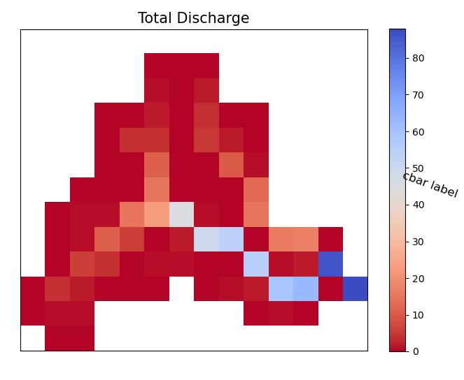
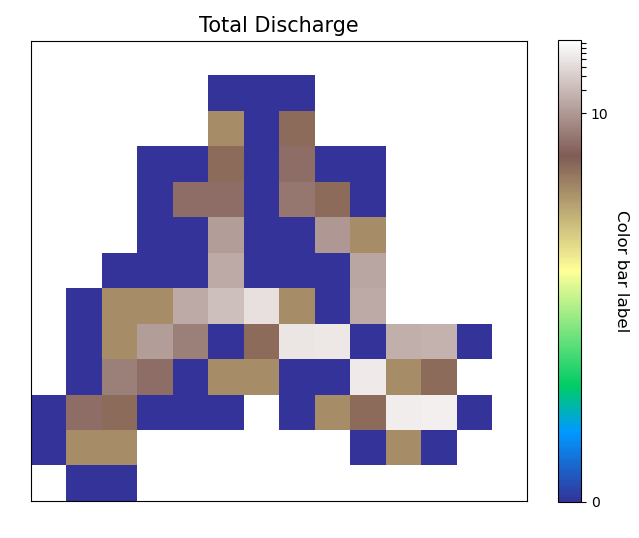
Default Plot#
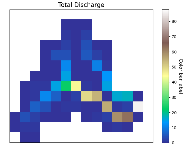
Then using all the default parameters in the PlotArray method you can directly plot the gdal.Dataset.
1vis.PlotArray(src)
2
3(<Figure size 576x576 with 2 Axes>,
4 <AxesSubplot:title={'center':'Total Discharge'}>)
- However as you see in the plot you might need to adjust the color to different color scheme or the
display of the colorbar, colored label. you might don’t need to display the labels showing the values of each cell, and for all of these decisions there are a lot of customizable parameters.
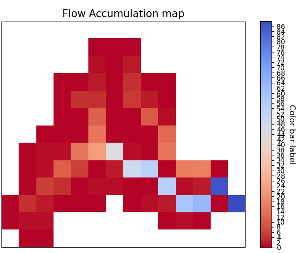
Basic Figure features#
First for the size of the figure you have to pass a tuple with the width and height.
- Figsize[tuple], optional
figure size. The default is (8,8).
- Title[str], optional
title of the plot. The default is ‘Total Discharge’.
- titlesize[integer], optional
title size. The default is 15.
1Figsize=(8, 8)
2Title='Flow Accumulation map'
3titlesize=15
4
5vis.PlotArray(src, Figsize=Figsize, Title=Title, titlesize=titlesize)
6
7
8(<Figure size 576x576 with 2 Axes>,
9<AxesSubplot:title={'center':'Flow Accumulation map'}>)
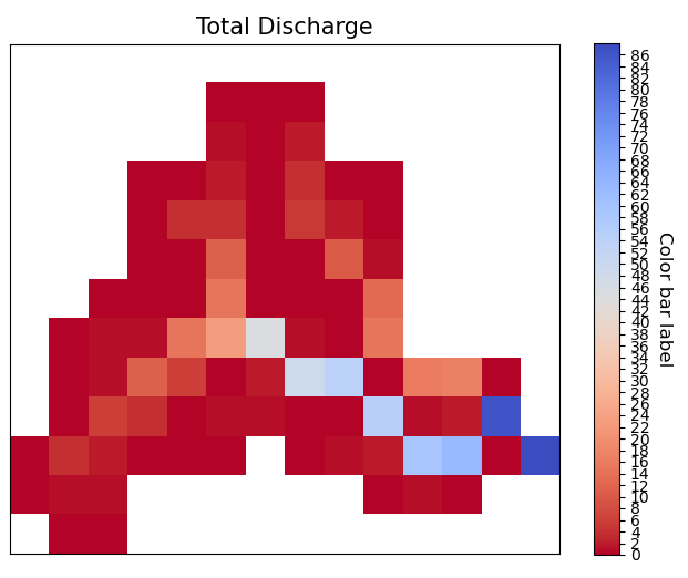
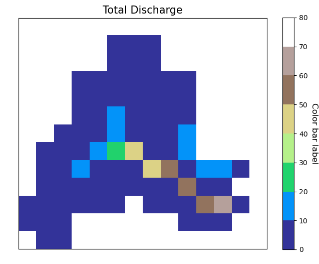
Color Bar#
- Cbarlength[float], optional
ratio to control the height of the colorbar. The default is 0.75.
- orientation[string], optional
orintation of the colorbar horizontal/vertical. The default is ‘vertical’.
- cbarlabelsizeinteger, optional
size of the color bar label. The default is 12.
- cbarlabelstr, optional
label of the color bar. The default is ‘Discharge m3/s’.
- rotation[number], optional
rotation of the colorbar label. The default is -90.
- TicksSpacing[integer], optional
Spacing in the colorbar ticks. The default is 2.
 1Cbarlength=0.75
 2orientation='vertical'
 3cbarlabelsize=12
 4cbarlabel= 'cbar label'
 5rotation=-20
 6TicksSpacing=10
 7
 8vis.PlotArray(src, Cbarlength=Cbarlength, orientation=orientation,
 9              cbarlabelsize=cbarlabelsize, cbarlabel=cbarlabel, rotation=rotation,
10              TicksSpacing=TicksSpacing)
11
12
13(<Figure size 576x576 with 2 Axes>,
14<AxesSubplot:title={'center':'Total Discharge'}>)
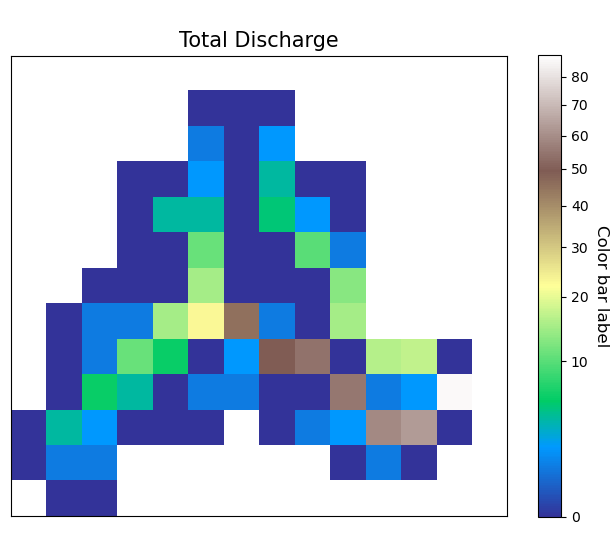
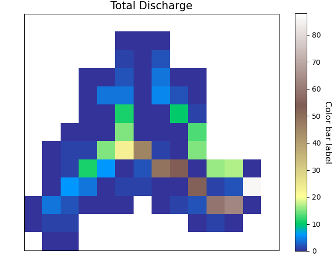
Color Schame#
- ColorScaleinteger, optional
there are 5 options to change the scale of the colors. The default is 1. 1- ColorScale 1 is the normal scale 2- ColorScale 2 is the power scale 3- ColorScale 3 is the SymLogNorm scale 4- ColorScale 4 is the PowerNorm scale 5- ColorScale 5 is the BoundaryNorm scale
- gamma[float], optional
value needed for option 2 . The default is 1./2..
- linthresh[float], optional
value needed for option 3. The default is 0.0001.
- linscale[float], optional
value needed for option 3. The default is 0.001.
- midpoint[float], optional
value needed for option 5. The default is 0.
- cmap[str], optional
color style. The default is ‘coolwarm_r’.
1# for normal linear scale
2ColorScale = 1
3cmap='terrain'
4vis.PlotArray(src, ColorScale=ColorScale, cmap=cmap, TicksSpacing=TicksSpacing)
5
6(<Figure size 576x576 with 2 Axes>,
7<AxesSubplot:title={'center':'Total Discharge'}>)
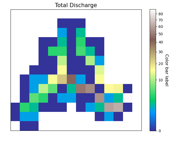
Power Scale#
The more you lower the value of gamma the more of the color bar you give to the lower value range
 1ColorScale = 2
 2gamma=0.5
 3
 4vis.PlotArray(src, ColorScale=ColorScale, cmap=cmap, gamma=gamma,
 5              TicksSpacing=TicksSpacing)
 6
 7vis.PlotArray(src, ColorScale=ColorScale, cmap=cmap, gamma=0.4,
 8          TicksSpacing=TicksSpacing)
 9
10vis.PlotArray(src, ColorScale=ColorScale, cmap=cmap, gamma=0.2,
11          TicksSpacing=TicksSpacing)
12
13(<Figure size 576x576 with 2 Axes>,
14<AxesSubplot:title={'center':'Total Discharge'}>)
SymLogNorm scale#
1ColorScale = 3
2linscale=0.001
3linthresh=0.0001
4vis.PlotArray(src, ColorScale=ColorScale, linscale=linscale, linthresh=linthresh,
5              cmap=cmap, TicksSpacing=TicksSpacing)
6
7
8(<Figure size 576x576 with 2 Axes>,
9<AxesSubplot:title={'center':'Total Discharge'}>)
PowerNorm scale#
1ColorScale = 4
2vis.PlotArray(src, ColorScale=ColorScale,
3          cmap=cmap, TicksSpacing=TicksSpacing)
4
5(<Figure size 576x576 with 2 Axes>,
6<AxesSubplot:title={'center':'Total Discharge'}>)
Color scale 5#
1ColorScale = 5
2midpoint=20
3vis.PlotArray(src, ColorScale=ColorScale, midpoint=midpoint,
4              cmap=cmap, TicksSpacing=TicksSpacing)
5
6
7(<Figure size 576x576 with 2 Axes>,
8<AxesSubplot:title={'center':'Total Discharge'}>)
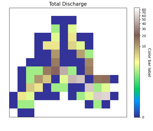
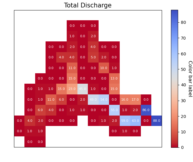
Cell value label#
- display_cellvalue[bool]
True if you want to display the values of the cells as a text
- NumSizeinteger, optional
size of the numbers plotted intop of each cells. The default is 8.
- Backgroundcolorthreshold[float/integer], optional
threshold value if the value of the cell is greater, the plotted numbers will be black and if smaller the plotted number will be white if None given the maxvalue/2 will be considered. The default is None.
 1display_cellvalue = True
 2NumSize=8
 3Backgroundcolorthreshold=None
 4
 5vis.PlotArray(src, display_cellvalue=display_cellvalue, NumSize=NumSize,
 6              Backgroundcolorthreshold=Backgroundcolorthreshold,
 7              TicksSpacing=TicksSpacing)
 8
 9(<Figure size 576x576 with 2 Axes>,
10<AxesSubplot:title={'center':'Total Discharge'}>)
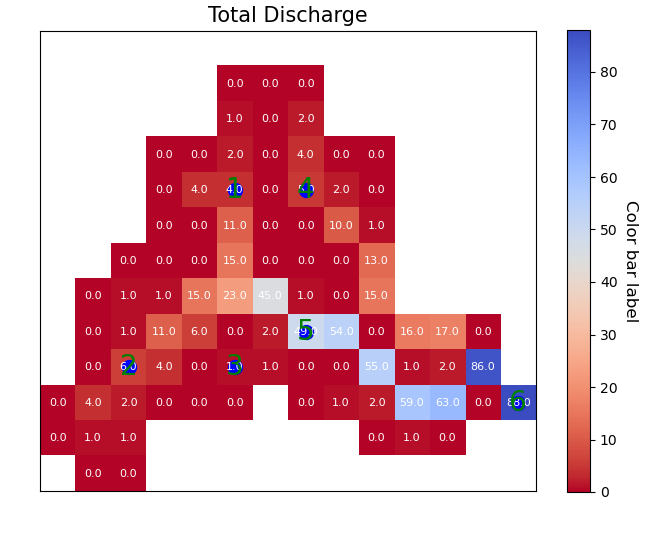
Plot Points#
if you have points that you want to display in the map you can read it into a dataframe in condition that it has two columns “x”, “y” which are the coordinates of the points of theand they have to be in the same coordinate system as the raster.
read the points
1pointsPath = "data/GIS/Hapi_GIS_Data/points.csv"
2points = pd.read_csv(pointsPath)
plot the points
 1Gaugecolor='blue'
 2Gaugesize=100
 3IDcolor="green"
 4IDsize=20
 5vis.PlotArray(src, Gaugecolor=Gaugecolor, Gaugesize=Gaugesize,
 6              IDcolor=IDcolor, IDsize=IDsize, points=points,
 7              display_cellvalue=display_cellvalue, NumSize=NumSize,
 8              Backgroundcolorthreshold=Backgroundcolorthreshold,
 9              TicksSpacing=TicksSpacing)
10
11(<Figure size 576x576 with 2 Axes>,
12<AxesSubplot:title={'center':'Total Discharge'}>)